- Colour keys
- Choosing moods
- Colour-blind friendly
- Pixel trackers
Mood tracker colour key ideas: how to choose your colours
Four ready-made colour keys to borrow, how many moods to track, and simple ways to choose colours you can tell apart at a glance, in pencil or on screen.
 By JPott Studios
About a 7 minute read
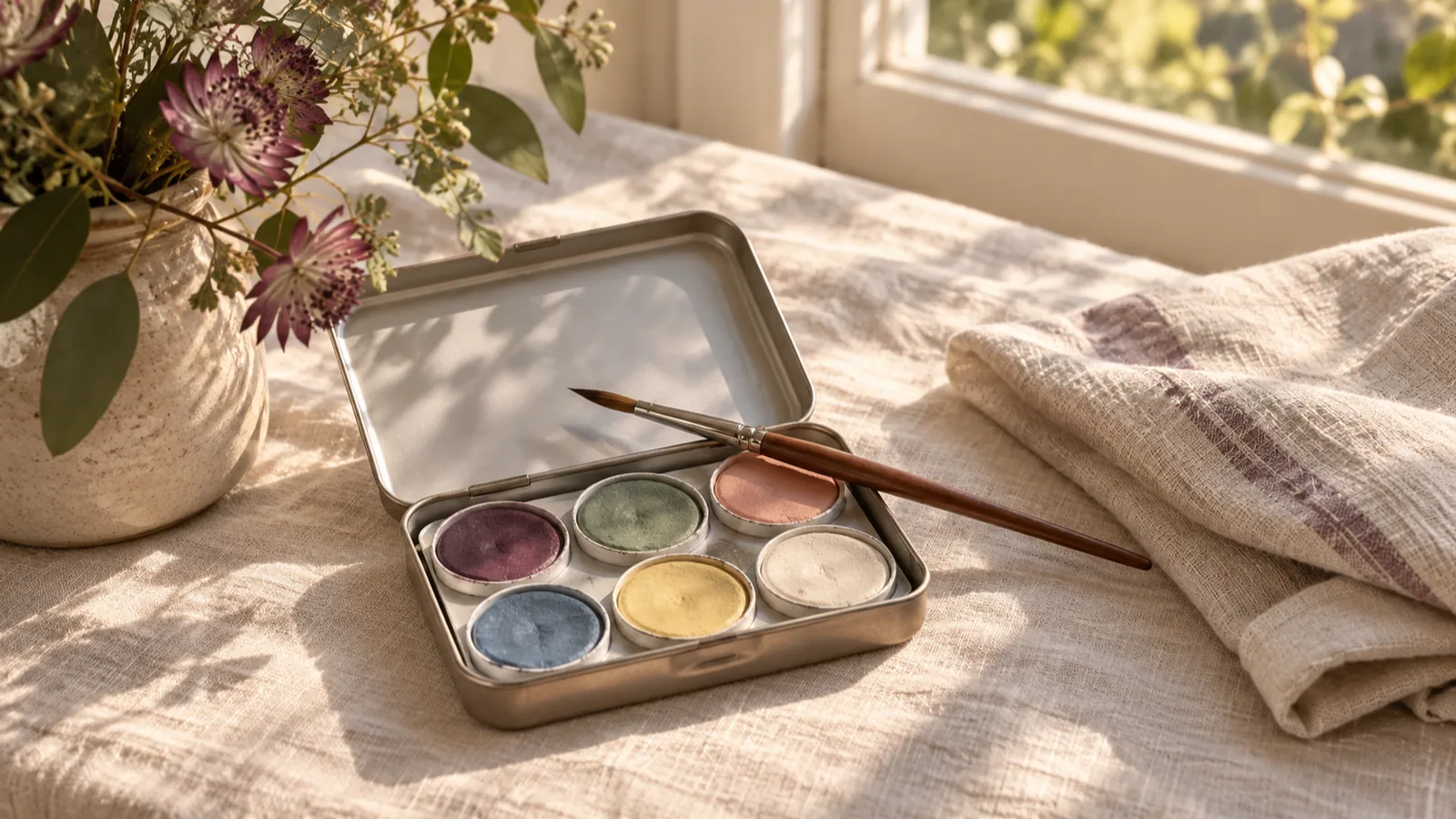
A good mood tracker colour key has five to eight moods, each with a colour you can tell apart at a glance, written down where you'll see it every evening. If you'd rather not start from scratch, there are four ready-made keys below to copy: calm, bold, pastel and colour-blind friendly.
Picking colours is the fun part of starting a year in pixels or a monthly mood calendar. It's also where plenty of trackers quietly go wrong: too many shades, two blues that look the same by lamplight, a key on page one that nobody checks again. A few minutes of thought now saves a lot of squinting in March.
How many moods should a mood tracker have?
For most people, five to eight moods is the sweet spot. That's enough to tell different kinds of days apart, and few enough to pick one in a couple of seconds when you're tired.
With fewer, the page starts to look the same. If your only choices are good, okay and bad, a stressful week and a sad week both come out as "bad", and you lose the part that's most useful when you look back. With many more than eight, choosing becomes a small job each night, and the colours start to crowd each other, especially in pencil.
How many moods to track
There's no wrong number. Each size has its own trade-off.
| Moods | Good for | Watch out for |
|---|---|---|
| 3 | A very quick daily tick, or tracking with children | Different kinds of hard day all look alike |
| 5 or 6 | A first tracker, and tired evenings | You may want one more word after a few weeks |
| 7 or 8 | Most people, once they know their usual days | Takes a week or two to learn the key |
| 10 or more | People who love detail | Slow to choose, and colours start to look alike |
If you're torn, start with six and give it a month. It's easy to add a mood you keep reaching for, and much harder to read back a year where half the colours were used twice.
Choose your mood words before your colours
It's tempting to start with a lovely new set of pens. Start with the words instead, because the words are what you'll really be choosing between each night.
- Use the words you'd actually say. "Flat", "wired" and "content" are more honest choices than a number out of ten, and easier to remember.
- Split up the hard days. Anxious, sad, angry and worn out feel very different, and it's useful to see which one turns up most.
- Include quiet good days, not only happy ones. Calm, steady and content are easy to miss if your only pleasant word is "great".
- Decide now what to do on mixed days. You might split a square corner to corner with two colours, or simply pick the feeling that was strongest.
Finding the right words is worth a little effort. Psychologists call it emotional granularity, and research by Lisa Feldman Barrett and others suggests that people who can put finer words to their feelings tend to find strong emotions a bit easier to manage. For more on what to record and when, see how to track your mood, and what to do with what you find.
Year in pixels colour meanings: is there a right answer?
No. There's no official meaning for any colour in a year in pixels, so the right key is the one that feels natural to you. Some links are common, though, and borrowing them makes a key easier to remember.
A large 2020 study led by Domicele Jonauskaite asked people in 30 countries to match colours with feelings. Some links were widely shared: red went with both love and anger, yellow with joy, and black with sadness. Plenty of others changed from country to country, and from person to person.
Whatever colours you pick, a few choices make the finished page easier to read:
- Keep similar feelings in similar colours, such as cool blues and greys for low days and warm yellows and oranges for bright ones. When you look back, the seasons show up as broad patches instead of confetti.
- Give hard days soft colours rather than harsh ones. You'll be looking at them again, and a gentle blue is kinder to come back to than a stark black.
- Save your strongest colour for something you want to spot quickly, like anxious days if you're keeping an eye on them.
Four mood tracker colour keys to copy
Each of these keys uses colours that sit comfortably together and stay easy to tell apart. Copy one exactly, or keep the colours and swap in your own mood words.
Four ready-made colour keys
Heavier days on the left, lighter days on the right.
Calm and muted
- Heavy
- Anxious
- Low
- Steady
- Content
- Bright
Bold
- Angry
- Anxious
- Sad
- Tired
- Okay
- Good
- Great
Pastel
- Sad
- Worried
- Cross
- Calm
- Happy
- Cosy
Colour-blind friendly
- Hard
- Low
- Anxious
- Cross
- Okay
- Good
- Great
Calm and muted
Soft, grown-up colours that look lovely together on cream paper. Six moods keep it quick to choose, and nothing on the page shouts, even in a hard month.
Bold
Strong, clear colours you'll find in almost any pack of felt tips, and they stand out from across the room. On thin paper, check that the red and orange don't bleed into each other.
Pastel
Gentle and pretty, and a joy with coloured pencils. Pastels can be hard to tell apart in dim light, so test each one in the spot where you usually fill in your tracker.
Colour-blind friendly
Built from a palette designed so charts stay readable for people with the most common kinds of colour blindness. It works well for anyone, and it's a safe choice if you'll ever share your tracker.
Colour-blind friendly mood tracker colours
Roughly 1 in 12 men and 1 in 200 women have some form of colour vision deficiency, most often trouble telling reds and greens apart. For them, a red for angry and a green for good can turn a whole page into near-identical squares.
The fourth key above uses the Okabe and Ito palette, created by the scientists Masataka Okabe and Kei Ito for exactly this problem. It leans on blue, orange, yellow and purple rather than red against green. A few more ways to keep any key readable:
- Vary how light or dark your colours are, not just their hue. Two colours of the same depth are the ones that get muddled.
- Add a small mark to one or two moods, like a dot for anxious days or a stripe for tired ones, so they read even without colour.
- Test it in black and white. Photocopy your key, or take a photo with your camera's mono filter. If two squares turn into the same grey, change one of them.
From JPott Studios
One calm email a month
One useful tip, one free printable or tool, and a short note from our apps. Join and get the free welcome pack: printable trackers, a packing list maker and more.
Using one colour as a scale
If you think of your days more as a scale than as different feelings, try five shades of a single colour instead of a rainbow. The deepest shade is the heaviest day, the palest is the lightest, and everything else falls in between.
One colour, five shades
A plum scale, from heavy days to light ones.
- Rough
- Low
- Okay
- Good
- Great
A scale is quick to fill in and very calm to look at. Because it relies on light and dark rather than hue, it also reads well for most kinds of colour vision. What it can't show is the kind of day: a tense day and a sad day might both land on "low". Some people get the best of both by using the scale and writing one word in the margin on days that stand out.

How to make your colour key easy to keep using
A key only works if you use it the same way all year. These small things help:
- Keep the key where you colour. Put it at the top of the page, or on a card tucked into the notebook, so you never have to guess which yellow meant what.
- Keep one set of pens or pencils just for the tracker. A slightly different blue from another pack can make January and June look like two different keys.
- Swatch before you start. Colour a small square of each on your real paper, in the light you'll usually be in, and check nothing bleeds through.
- If you change the key, note the date. Adding a mood in April is fine. Just mark it, so March still makes sense.
For a head start on paper, our free printable mood tracker prints a month with a blank mood key, so you can colour in whichever set you picked from this guide. Pairing it with a two-minute evening check-in makes the square easy to remember, and our mood tracker ideas cover other formats, from a colour-in month to a jar of beads.
And if you'd rather not choose at all, Softly Noted, the mood diary app we make, has a Year in Pixels view that fills itself in. You tap one of 15 feelings, and that day's square takes on the feeling's colour.
Mood tracker colour questions
What colors should I use for a mood tracker?
Any colours you can tell apart easily in the light where you fill it in. Many people use cool blues and greys for low days and warm yellows and oranges for good ones, which makes patterns easy to spot. The four keys in this guide are ready to copy.
How many moods should I track?
Five to eight works for most people. Fewer makes different kinds of hard days look alike, and more makes choosing slow. If you're unsure, start with six and adjust after a month.
What do the colours mean in a year in pixels?
Whatever you decide. There's no standard meaning, so every tracker has its own key written on the page. Some links are widely shared, like yellow for joy, and borrowing them makes a key easier to remember.
What are good colour-blind friendly colours for a mood tracker?
Choose colours that differ in lightness as well as hue, and don't rely on red against green. The Okabe and Ito palette of blue, sky blue, reddish purple, vermilion, yellow, bluish green and orange is a well-tested choice. Test your key in black and white to be sure.
Can I change my mood tracker colours partway through the year?
Yes. Add or change a mood whenever you need to, and write the date of the change next to your key. That way the earlier months still make sense when you read them back.
If the colours turn heavy. A mood tracker can show you a pattern, but it can't tell you what it means or fix it. If low, anxious or angry days keep filling the page, or something feels too big to carry alone, please talk to someone you trust, or to a doctor or counsellor. If you might be in danger, call your local emergency number straight away.
From JPott Studios
One calm email a month
One useful tip, one free printable or tool, and a short note from our apps. Join and get the free welcome pack: printable trackers, a packing list maker and more.